
The best Facebook cover photo size is 820 pixels wide by 360 pixels tall. That’s the sweet spot that looks great on both desktop and mobile without getting awkwardly cropped or stretched.
But there’s a little more to it than just the numbers—especially if you’re using text, branding, or call-to-action elements in your image.
The Optimal Facebook Cover Photo Dimensions
Platform
Recommended Size
Safe Zone for Text & Logos
Universal (Best Practice)
820 x 360 px
Center 640 x 312 px
Minimum Size
400 x 150 px
N/A
Mobile Display
Cropped to 640 x ~360 px
Keep content away from edges
Desktop Display
Shows full 820 x 312 px
Avoid top & bottom crop
Why 820 x 360 px Works Best
Facebook officially recommends 820 x 312 pixels, but many designers now use 820 x 360 pixels to account for mobile cropping and maintain better visual consistency. This extra height ensures your image won’t lose key content at the top or bottom when viewed on a phone.
Here’s how Facebook treats the same image:
- Desktop: Shows 820 x 312 px. Anything beyond that is cut off.
- Mobile: Shows a taller portion of the image, roughly 640 x 360 px. It crops the sides but shows more height.
If your image is taller than 360px or too wide, Facebook will crop or compress it, which can lead to blurry text or missing edges. Keeping to 820 x 360 ensures everything looks tight and clean.
Design Tips to Get It Right
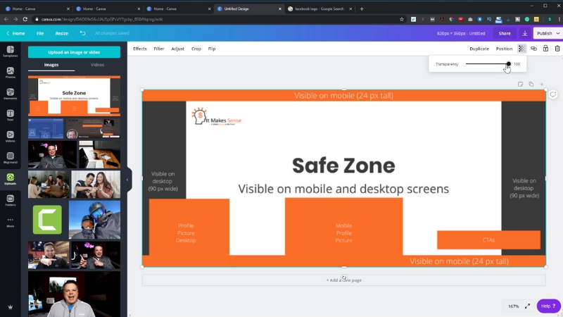
- Keep important elements (like logos or text) inside the center “safe zone” (about 640 x 312 px). That way, nothing gets chopped off on mobile or desktop.
- Use JPG or PNG format. PNG is best if your design has text or crisp graphics. JPG works well for photos.
- Avoid uploading super-large images. Facebook compresses high-res files aggressively, which can ruin quality. Stick close to the recommended size.
- Preview before you publish. Upload it to a private group or test page if needed, so you can see how it appears across devices.
Final Answer
Use 820 x 360 pixels for your Facebook cover photo. That size will give you full coverage on mobile while keeping your image sharp and intact on desktop. Just remember to keep key content in the center zone so it doesn’t get cropped.
If you’re designing for a business, event, or personal brand, this small adjustment makes a big difference in professionalism.
Choosing the right colors for your banner ad also plays a key role—aim for contrast and brand consistency to capture attention fast.
And if you’re ever unsure, test it live—because nothing beats seeing it exactly as your audience will.