Scrolling past a boring banner ad is just muscle memory at this point. It happens so fast, you barely know it’s there. But when a color combo hits just right? You stop. Even if only for a second, your brain goes: “Ooh, what’s that?” That’s the power of color.
It’s silent, subconscious, and wildly effective when used right. Picking colors for your banner ad isn’t just about taste—it’s strategy. There’s actual psychology and data behind what grabs attention, sparks emotion, or makes someone click that CTA button.
It doesn’t matter if you’re creating ads for your own brand or managing client campaigns, the way you work with color can make or break the entire design.
So let’s break it all down—no design degree required.
Why Colors Matter More Than You Think
People make snap decisions—especially online. In fact, studies suggest that up to 90% of product judgments are made within 90 seconds of initial viewing, and color heavily influences that impression.
A banner ad has maybe a second (if that) to get someone to care. So your color choices? Yeah, they matter.
- Reflect your brand’s vibe instantly.
- Highlight key parts of the ad like offers or CTAs.
- Trigger emotional responses (yes, feelings lead to clicks).
- Help your ad stand out in the visual noise of social feeds and websites.
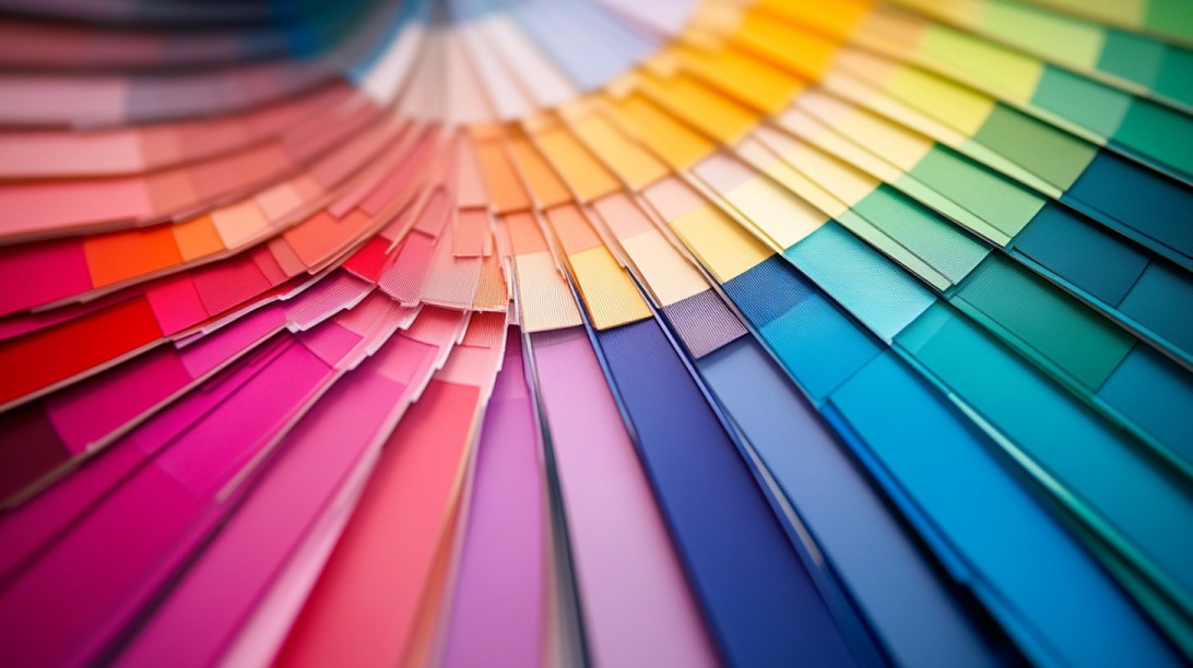
Color Psychology—What Feelings Do Your Colors Trigger?

Every color has a personality. Whether viewers know it consciously or not, color signals certain emotions. Here’s a quick cheat sheet based on real-world campaigns and studies:
| Color | Feels Like | Best Used For |
| Red | Energy, urgency, passion | Sales, CTAs, flash offers |
| Blue | Trust, calm, reliability | Finance, tech, healthcare |
| Yellow | Optimism, cheer, warmth | Summer sales, kids’ products |
| Green | Growth, nature, freshness | Wellness, eco-friendly brands |
| Purple | Luxury, creativity, imagination | Beauty, upscale services |
| Orange | Energy, playfulness, excitement | Entertainment, food, lifestyle |
| Pink | Feminine, soft, friendly | Fashion, beauty, niche products |
Red, for example, has been shown to outperform green on CTA buttons by up to 21% in conversion tests. But that doesn’t mean you should slap red on everything—it has to fit your message and your brand.
Don’t Skip the Cultural Layer
Color is also cultural. What looks “clean” or “lucky” in one part of the world might signal mourning or danger elsewhere.
- White = Purity (U.S., Europe) but mourning (China, India)
- Red = Luck (China), but warning or stop (North America)
- Green = Nature (U.S.), but can suggest illness (Middle East)
If you’re targeting a global or multicultural audience, lean toward safe, neutral tones like blue or green unless you’re tailoring region-specific designs.
Working with Color Theory
You don’t need to know every technical term—but having a grasp of color theory can keep your banner from looking chaotic or “off.” Here are the four main ways to pair colors like a pro:
🟢 Complementary (High Contrast)
Colors that sit opposite on the wheel—like red and green or blue and orange. Use this when you want something to pop (like your CTA button).
🔵 Analogous (Smooth & Soothing)
Colors that are next to each other—like blue, teal, and green. This creates harmony and is easier on the eyes. Good for background palettes.
🔺 Triadic (Vibrant & Balanced)
Three colors evenly spaced around the wheel—like red, yellow, and blue. Works for playful, bold campaigns where contrast still needs control.
🔵 Monochromatic (Minimal & Clean)
Tints and shades of the same color. Super modern and cohesive. Think navy, sky blue, teal. Great for luxury or sleek tech ads.
- Pro tip: Stick to 2-3 main colors max. Anything more can overwhelm the viewer, especially on small screens.
Your Brand Should Lead the Way
Before you go palette-hunting, look at your brand guidelines—if you’ve got them. Your banner ad isn’t just a standalone graphic; it’s part of your bigger brand ecosystem.
Let’s say your brand colors are navy and white. Using hot pink on your ad might grab attention, sure, but it could feel disconnected from everything else (like your website, emails, or logo).
- Sleek, corporate? Stick to cool tones: blue, grey, black.
- Whimsical, youthful? Use bright pops: yellow, coral, mint.
- Natural, grounded? Go for earthy shades: greens, browns, muted oranges.

Contrast = Readability (and Clicks)
No one’s clicking a banner they can’t read. High contrast isn’t just a visual bonus—it’s crucial for accessibility and performance.
- Dark background? Use white or light-colored text.
- Light background? Go for black, navy, or charcoal text.
- Call-to-action button? Make sure it doesn’t blend into the background.
Example
- White background + red CTA = Eye-catching and readable
- Navy background + white CTA = Clean and trustworthy
Want to test contrast? Tools like WebAIM’s Contrast Checker can help make sure your text passes accessibility guidelines.
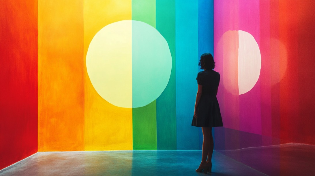
Guide the Viewer’s Eye With Color Hierarchy
Color can actually lead someone’s attention—if you use it with intent.
- Warm colors (red, orange, yellow) = Pull the eye in
- Cool colors (blue, green, purple) = Recede into the background
Put your most important info (headline, CTA) in warm or bold colors. Use cooler tones for background areas or secondary text. You’re not just decorating—you’re directing.
Don’t Guess—Test.
Even with the best research and strategy, you won’t really know what works until you test. A/B testing (a.k.a. split testing) lets you compare color variations in real campaigns.
- Red CTA vs. blue CTA
- Bright background vs. dark background
- Color-heavy vs. minimal design
Platforms like Google Ads, Facebook Ads, or even Canva Pro’s analytics tools offer basic A/B testing. It’s not about opinions—it’s about results.
Match the Season or Mood
Colors aren’t static. What feels right in December might not land in July. Try aligning your palette with the season or theme of your campaign:
| Season/Event | Suggested Colors |
| Spring | Pastels: light pink, mint, soft yellow |
| Summer | Bright: yellow, sky blue, coral |
| Fall | Warm: orange, rust, burgundy |
| Winter | Cool: navy, silver, icy blue |
| Christmas | Red, green, white |
| Halloween | Orange, black, purple |
Make It Accessible to Everyone

Designing for accessibility isn’t optional anymore. Your color choices should work for users with visual impairments too—including color blindness.
- Always use high-contrast text.
- Don’t rely solely on color to show information (use icons, labels, or text).
- Avoid red-green combinations as they’re most commonly confused.
Want to double-check your ad’s accessibility? Try simulators like Color Oracle or check with Stark in Figma.
Real Ads That Got It Right
- Samsung Galaxy Z Flip 5: Used a loud pink phone on a soft gray background. One-color highlight = total scene-stealer.
- Airbnb: Pale blue skies, earthy browns, soft pink CTAs. Perfectly relaxing, just like a good vacation ad should feel.
- Coca-Cola (Holiday Campaign): Bold red with green accents. On-brand and festive—without screaming.
- AARP: Dominant red to show urgency, balanced with trust-building blue.
Each one had a clear visual point of focus, solid contrast, and colors that matched their message.
Handy Tools to Make It Easier
No need to eyeball every combo.
- Adobe Color CC – Build palettes based on real theory.
- Coolors.co – Hit “spacebar” to generate new palettes instantly.
- Canva Color Wheel – Beginner-friendly and visual.
- Paletton – For color nerds who want precision.
- ColorZilla (Chrome Extension) – Pick colors directly from any webpage.
Bonus: If you’re looking for alternatives for Adobe Stock, these 15 listed programs are worth your while!
Watch Out for Common Pitfalls
Even pros mess up.
- Too many colors: It’s not a circus. Stick to 2–3 dominant colors max.
- Low contrast: If your mom can’t read it on her phone, it’s a fail.
- Forgetting your audience: Cultural context matters. Don’t assume.
- No testing: Even gorgeous banners can flop without data.
Wrapping It Up
Color isn’t just about looking pretty—it’s doing heavy lifting in your banner ad. It grabs attention, builds trust, sparks emotion, and guides behavior. So next time you’re designing a banner, don’t treat color as an afterthought.
Treat it like the quiet powerhouse it is. Pick with purpose, test your hunches, and trust what the data tells you. Because the right color? It could be the difference between a scroll-by and a click-through.