
Modern web users show limited patience and very high expectations.
Annoying website features like cluttered layouts, slow load times, or intrusive pop-ups can push visitors away almost instantly.
A Contentsquare study reports that 68% of users leave a site after a poor UX experience.
Modern UX solutions solve these pain points and help websites feel smooth, respectful, and easy to use.
To do that properly, we will recommend you practical UX approaches below that can help with removing friction and building:
- Positive engagement
- Retention
- Satisfactio
Without further ado, let’s go.
| UX Focus Area | Core Problem | User Impact |
| Simplify UI and Minimize Clutter | Information overload and visual noise | Early exits and higher bounce rates |
| Optimize Pop-ups and Interruptions | Intrusive prompts and poor timing | Broken flow and reduced trust |
| Improve Navigation and Avoid Confusing Menus | Unclear or complex navigation | Hesitation and abandonment |
| Speed Up Page Load and Mobile Performance | Slow load times | One in four users leave after four seconds |
| Improve Accessibility and Inclusive Design | Limited accessibility features | User exclusion and silent drop-offs |
| Use Clear, Helpful Forms and CTA Design | Complex forms and vague actions | Lower completion and cart abandonment |
| Tailor Content and Reduce Overload | Dense and unfocused content | Mental fatigue and reduced engagement |
1. Simplify UI and Minimize Clutter
View this post on Instagram
Cluttered layouts overwhelm visitors and raise bounce rates. Information overload damages decision-making and engagement, while overly busy layouts create visual fatigue and confusion.
Visual noise forces users to pause, reorient, and question next steps, which often leads to early exits before any real interaction begins.
Whitespace gives content room to breathe and naturally guides attention toward what matters most.
Open space helps users separate ideas mentally and reduces the feeling of pressure created by crowded screens.
Fewer choices per page reduce mental strain and help users act faster without hesitation.
Clean and consistent layouts paired with a strong visual hierarchy allow pages to feel calm and predictable, even when content volume grows.
Several design actions consistently reduce overload and restore clarity:
- generous spacing between sections to separate ideas and improve flow
- consistent typography that signals importance, structure, and order
- restrained color use that avoids competing focal points
A minimal interface lowers cognitive load and supports smoother navigation, allowing visitors to focus on goals instead of interface mechanics.
2. Optimize Pop-ups and Interruptions
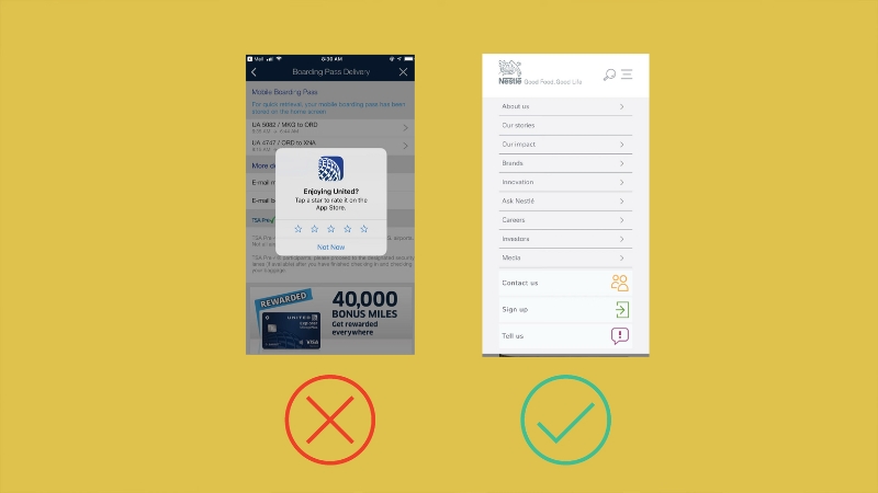
Exit-intent pop-ups respect user timing better than immediate triggers that appear before engagement forms. A quality pop ads network will be aware of this and ensure they build relationships before targeting ads at customers. Closing actions should stay obvious and effortless to avoid irritation.
Poor control often results in ads appearing too early, too often, or without relevance, which makes the experience feel pushy and disruptive rather than helpful.
Aggressive prompts drive visitors away quickly, while interruptions only succeed when the value feels obvious, and the disruption stays minimal.
Poor timing makes pop-ups feel self-serving and breaks concentration during critical moments.
Exit-intent pop-ups respect user timing better than immediate triggers that appear before engagement forms. Closing actions should stay obvious and effortless to avoid irritation.
Several improvements protect user flow while preserving conversion goals:
- delaying prompts until engagement signals appear
- avoiding full-screen overlays except for critical messages
- replacing interruptions with inline calls to action
Embedded calls to action and subtle banners support promotions without breaking focus. Respectful timing keeps sessions longer and lowers bounce rates.
3. Improve Navigation and Avoid Confusing Menus
Poor navigation frustrates users and leads to abandonment.
Confusing menus and dead-end paths increase bounce rates, while unclear or overly complex navigation remains one of the most common UX issues.
Friction often appears when users hesitate, backtrack, or repeatedly open menus searching for direction.
Menus perform better when labels remain simple and groupings reflect user expectations. Logical structure helps visitors predict where information lives without guesswork.
Familiar patterns reduce anxiety and speed up decision-making.
Strong navigation depends on a few clarity-focused practices:
- clear menu labels that avoid internal jargon
- shallow menu depth that limits excessive nesting
- breadcrumb trails that show page location at a glance
Overly nested dropdown menus often hide valuable content and slow decisions.
Easy navigation builds trust by helping users find what they need within seconds, reducing frustration and hesitation.
4. Speed Up Page Load and Mobile Performance
Slow websites lose visitors fast. One in four users abandon a site that takes longer than four seconds to load.
Performance issues rank among the leading causes of poor UX, especially on mobile devices where patience runs thin, and network conditions vary.
Delays interrupt momentum and create doubt before users even see value.
Performance gains come through deliberate technical choices that reduce friction and remove unnecessary weight.
Sites that feel fast usually rely on a focused optimization approach.
Several improvements consistently lower load times:
- image compression paired with next-generation formats that reduce file size without sacrificing quality
- browser caching that limits repeated downloads for returning visitors
- reduced reliance on third-party scripts that slow rendering and block interaction
Heavy plugins and unnecessary integrations add complexity without user benefit.
Faster pages feel responsive and dependable, helping visitors stay engaged across screen sizes, devices, and connection speeds.
5. Improve Accessibility and Inclusive Design
Limited accessibility excludes a large portion of users.
Keyboard navigation, alt text, and closed captions remain essential UX elements, while accessibility improvements raise engagement across age groups and abilities.
Barriers often go unnoticed until users struggle, abandon tasks, or leave silently.
Full keyboard navigation supports visitors who rely on assistive tools or prefer non-mouse interaction. Visual clarity improves when contrast ratios and font choices favor readability in varied lighting conditions.
@syntaxfm ARIA-label provides context to non-descriptive items, helping screen readers understand the purpose of elements on your page Episode #701 A11y Treats – Labels & Roles Discussion on using ARIA roles and labels to make web apps more accessible, including legal requirements, providing context for UI elements, and testing tools. #accessibility #a11y #ui #webdev #softwaredev #aria #arialabel #programming #webaccessiblity #appaccessibility #design #frontend ♬ original sound – Syntax Podcast
Several measures strengthen accessibility across interfaces:
- ARIA labels that clarify structure and intent for screen readers
- alt tags that describe visual content accurately and contextually
- captions that make the video usable without sound or audio access
Inclusive design expands reach and supports accessibility compliance while improving usability for everyone, not only users with specific needs.
6. Use Clear, Helpful Forms and CTA Design
Complex forms and vague calls to action reduce conversions.
Complicated checkout processes often cause cart abandonment, while shorter and clearer forms increase completion rates.
Friction rises quickly when users feel interrogated, rushed, or uncertain about progress.
Single-column layouts reduce scanning effort and keep attention focused on one decision at a time. Forms perform better when only essential fields appear, and steps feel manageable.
Conversion-friendly design choices include:
- guest checkout options that remove account pressure
- multiple payment methods that respect user preference
- primary calls to action that remain visually dominant
Secondary actions should stay subdued to avoid distraction or hesitation. Reduced friction helps users complete key tasks quickly and confidently, reinforcing trust.
7. Tailor Content and Reduce Overload

Overwhelming content makes value harder to find. Scan-friendly structure using subheadings and lists improves clarity, while large text blocks and irrelevant information weaken engagement.
Dense layouts slow comprehension and increase mental fatigue.
Chunked content improves readability and focus across devices. Headlines, short paragraphs, and visual cues support fast scanning without sacrificing depth.
Meaningful organization relies on several principles:
- progressive disclosure that reveals details only when needed
- personalization based on behavior or location
- selective use of media that supports clarity instead of distraction
Clear structure keeps users oriented, reduces effort, and encourages continued interaction without fatigue.
Closing Thoughts
Every interaction shapes how visitors feel about a website.
Removing friction through speed, clarity, and accessibility improves satisfaction and conversion rates.
Virtual Stacks captures the idea clearly by noting that annoying websites do not just get ignored are but actively avoided. UX focuses on respect and ease, not decoration.
Applying these seven solutions helps turn frustrating websites into smooth, user-friendly experiences.