In 2025, rustic visual branding cuts through because it feels like something built with hands, not software. It shows grit, wear, and age.
The colors come from dirt, smoke, old barns, and firewood. Letters look drawn with a pencil that broke once or twice. You see cracks in the paint. Nothing is clean. That is the point.
People connect with what feels real. Brands use this look because it feels like it belongs to something that worked, broke, got fixed, and kept going. It speaks without trying to sell.
That is why it works.
Thin Brick Brings Grip, Depth, and Familiar Tone
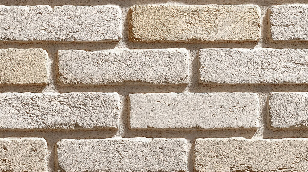
Thin brick adds something physical to a design. The lines, cracks, and rough patches feel like places people know. It reminds people of old walls, warm spaces, and solid corners. That sense of place makes a brand feel grounded.
Texture holds attention
Each brick shows its own shape, color shift, and edge. That kind of detail gives the whole layout weight. It builds a rhythm that slows the eye down and creates focus. Thin brick turns flat design into something that sticks.
Works across formats
Print, signs, packaging, websites – thin brick fits into every setup. It pairs with simple type, muted colors, and an honest layout. People see it and think of places built with care. That’s why more brands now ask for product options for brick flooring with the same look.
Earth Colors Make the Design Feel Stable
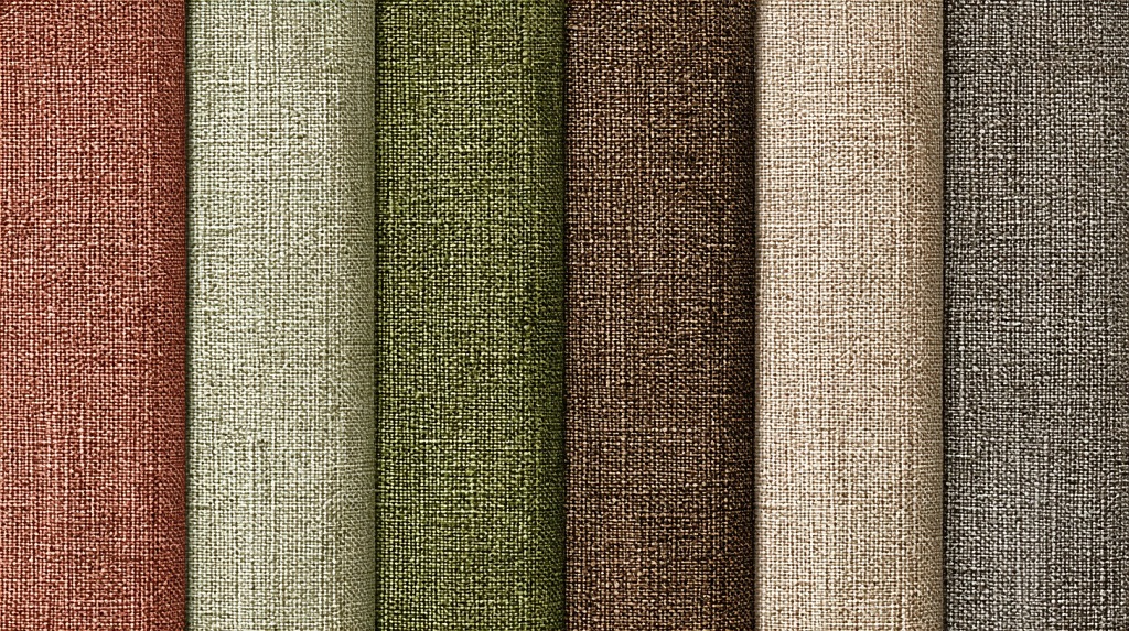
Brown, clay red, olive green, and stone gray bring calm without looking dull. These colors come from real places. People connect with them fast.
They look like soil, brick, trees, and rusted metal. When placed behind text or images, they help the whole space feel balanced. Nothing looks too sharp. Nothing floats.
Every part feels locked in. A good design should feel steady, not restless. Earth colors help with that.
Works with wood, brick, and stone
You can drop these colors next to brick, timber, or dark metal, and they fit right away. No shift in tone. No clash. That match matters.
A layout should speak with one voice. When every element shares a common feel, the brand message gets stronger.
Earth tones help keep that feel consistent. They help the eye move across the screen or surface without tension. People stay longer when the space feels natural and grounded.
Simple Fonts Keep the Design Clear
Good fonts for rustic branding use strong lines, clear shapes, and space between letters. Nothing leans too far. Every word sits in place. That kind of structure makes the message feel direct.
No effort is needed to read. No guesswork. That builds trust. People feel like the brand knows what it stands for. Fonts should feel like real labels, not decoration. Simple shapes send a clear signal.
Matches real materials without extra tricks
When the background has brick, wood, or any rough surface, the font needs to fit in. Thin lines fade out. Sharp tricks stand out too much. A clean, simple font works across signs, websites, packaging, or menus.
It connects with real materials without looking out of place. That connection makes the full layout stronger. The text does not fight the surface. It supports it. That makes the message feel solid. That makes people believe what they see.
Real Materials Bring the Whole Look Together
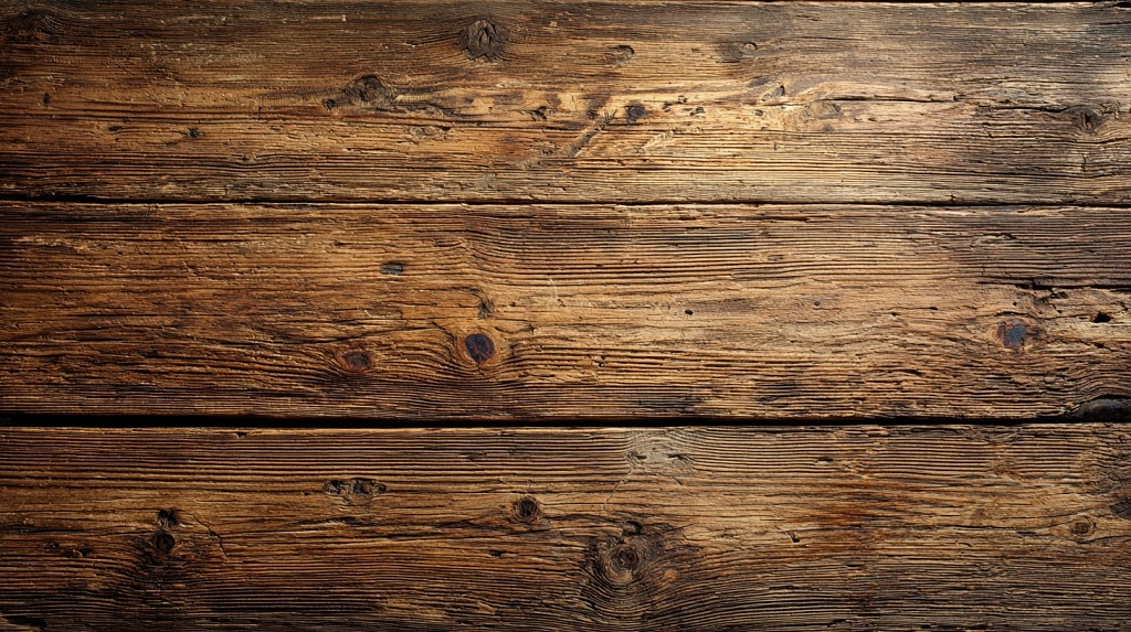
Brands that use rustic visuals need surfaces that feel solid. Brick, wood, metal, and stone do that without effort. These materials carry years. They hold marks, stains, dents, and wear. That texture gives the layout weight.
You do not need to explain it. People see it and feel something real. Every part of the design works better when the base has grit.
Brick and wood carry memory
When people see brick, they think of old houses, shops, or buildings that stayed up. Wood brings the same feeling. You see grain, scratches, knots. That history gives the layout more than just shape. It gives it a story without words.
Metal and stone hold space
Steel, iron, concrete, slate. These materials fill space with strength. They feel hard, cold, rough. They help the design stay in place. You build trust by using things that last. Real materials never feel fake or rushed.
Layout Needs Order, Space, and Clear Structure
Every part of the design should have a place. The surface, the text, the photo, and the logo should never overlap in a way that feels random. A clear layout helps each element land right.
When things line up and stay in their own spots, the full image becomes easier to take in. That makes the design work better without needing extra effort.
Keep text blocks short and sharp
Long paragraphs slow everything down. Use short groups of text with even spacing. Each one should carry a point. That makes the message easier to follow.
Give images room on all sides
Photos with tight borders feel trapped. Leave space around them. Let the edge of the photo breathe so the viewer sees the full image without feeling boxed in.
Use straight lines and even gaps
The layout should feel stable. Keep the text in lines that follow the same edge. Use equal space between elements. The eye follows patterns faster than scattered parts.
Let the surface speak for itself
Brick, wood, or metal in the background needs space to show. Do not cover it with boxes or blocks. Let the material fill a section of the layout on its own. That adds balance. That gives the whole image more grip.
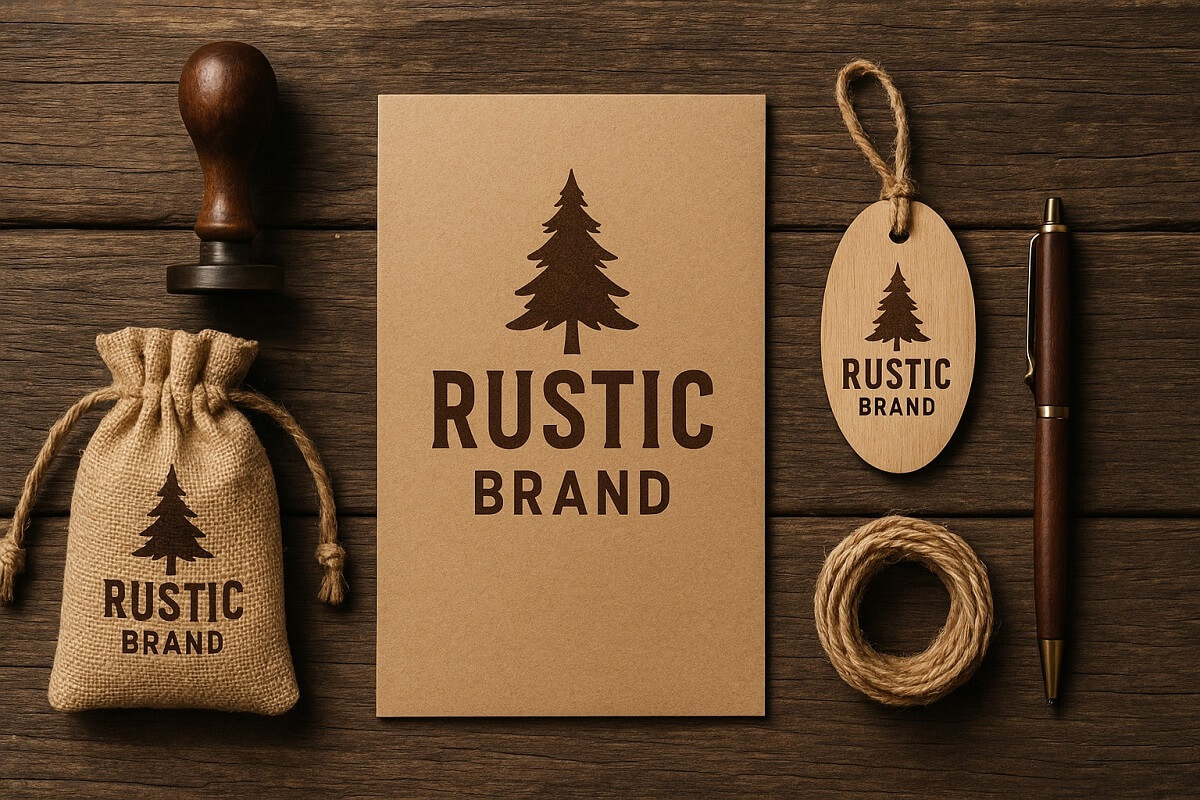
Brand Marks Should Match the Surface and Feel Fixed in Place
A logo works better when it looks like part of the material, not floating above it. On brick, wood, or steel, the brand mark should feel stable. That look builds trust. People believe what feels built, not added.
Use solid shapes without extras
The best marks use clean lines, thick weight, and no special effects. A shape that feels cut, stamped, or pressed fits better in rustic design than one that feels drawn or layered.
Align color with the background
If the surface is dark, the mark should contrast with strength. If the surface is light, the mark should stay steady in tone. Each choice should match the texture without pulling too hard.
Give the mark space to stand
A brand mark needs air around it. Cramming it between text or over busy texture makes it weaker. Place it where the surface is quiet, so it holds attention.
Photography Should Look Real and Unstaged
Photos carry more weight than graphics in rustic branding. They show the world people expect to see – raw surfaces, used tools, old walls, scratched floors. Every image should look like a real place. Nothing in the photo should feel arranged or planned.
Show what exists, not what sells
The best photos show dirt on boots, cracks in the wall, faded paint, and rusty handles. That kind of detail tells people the space is used, not made for pictures.
Use light that fits the space
Natural light works best. A photo shot during the day, with clear shadows and honest tone, matches the rest of the design. No studio glare. No fake color shift.
Keep the angle flat and focused
Shoot straight. Frame the subject in the center or with a strong base. No tilts, no lens tricks, no depth blur. The photo should feel like what a person sees with their own eyes.
The Bottom Line
Rustic visual branding works in 2025 because it feels real. Brick, wood, metal, dust, faded color, and honest shape all give people something they can believe. Every part of the layout matters. The surface needs to hold weight. The font needs to stay clear. The image needs to look like a real place. The mark needs to fit the material behind it. When all of that lines up, the brand feels steady.
None of this relies on style. It comes down to choices. Use real texture. Use solid structure. Show things the way they are. Brands that stick with that approach will stand longer, look better, and draw people who care more.
That is the full picture.