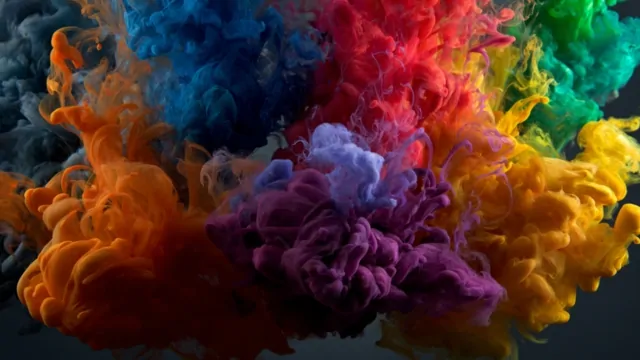
In digital marketing, small visual decisions often shape big business results. Among the most overlooked but impactful factors is color.
The shades you choose for your website, ads, or call-to-action (CTA) buttons can nudge users toward clicking, buying, or subscribing without a single word.
According to the Emerald Insight study, up to 90% of snap judgments about products are influenced by color, and over 92% of consumers cite visual appearance as their top factor in deciding to purchase.
Marketers who understand how colors influence behavior can design campaigns that feel intuitive, inviting, and persuasive. With the right color strategy, a single tweak – like changing a button from green to red – can lift conversion rates by double-digit percentages.
Let’s explore the psychology behind color in marketing, why it matters, and the seven colors proven to move the needle.
A Quick Look
Color
Emotional Impact
Best Use Cases
Example Brands
Key Insights
Red
Urgency, passion, excitement
CTAs, flash sales, “Buy Now” buttons
Coca-Cola, YouTube
21% conversion lift vs. green
Blue
Trust, stability, calm
Finance, tech, healthcare
Chase, Facebook
Broad appeal: 57% men, 35% women
Green
Health, growth, safety
Wellness, eco brands, proceed buttons
Starbucks, Subway
6.3% higher conversions
Orange
Confidence, friendliness, energy
CTAs, kid/fun campaigns
Blogger, Harley-Davidson
32% lift on tested landing pages
Yellow
Happiness, energy, optimism
Highlights, food/energy branding
McDonald’s, DHL
$23M Heinz green ketchup sales
Purple
Luxury, creativity, sophistication
Premium, creative, or tech branding
Yahoo, Taco Bell
Strong appeal in female and creative markets
Black
Luxury, elegance, authority
High-end branding, minimalist layouts
Mercedes-Benz, Rolls-Royce
Better for branding than direct-action CTAs
1. Red

- Emotional Impact: Urgency, passion, energy, excitement
- Best Uses: CTAs, flash sales, “limited-time” offers
Red is a natural attention-grabber. It’s dynamic, high-energy, and excellent for driving immediate action.
E-commerce sites often use red for “Add to Cart” or “Buy Now” buttons to encourage impulse decisions. Brands in entertainment and online gaming, such as bet365, also leverage vibrant red accents to capture attention and drive quick clicks.
Statistics and Examples
- According to a CXL article, HubSpot ran a test on a client’s site and observed that the red button converted 21% better than the green one. The test had over 2,000 visitors over several days.
- YouTube and Coca-Cola rely on red to spark energy and quick engagement.
- Many clearance sales and holiday promotions default to red for its ability to trigger urgency.
The key is moderation. Too much red can feel overwhelming, but the right touch can boost clicks and sales.
2. Blue

- Emotional Impact: Trust, stability, calm, intelligence
- Best Uses: Financial services, healthcare, technology
Blue is one of the most versatile colors for digital marketing. It creates a sense of security, which makes it ideal for brands that handle money, health, or personal information.
Statistics and Examples
- According to the Fiverr Blog, blue is the favorite color for 57% of men and 35% of women.
- Facebook, LinkedIn, Twitter, and PayPal all use blue to project trust and encourage engagement.
- Banks like Chase and Citibank rely on blue to build credibility and comfort.
Blue works well in site backgrounds, logos, and navigation bars. It’s less common as a primary CTA color but excels in brand-building.
3. Green
View this post on Instagram
- Emotional Impact: Health, growth, safety, balance
- Best Uses: Wellness, eco-friendly products, “Go” or confirm buttons
Green is calming and reassuring. It’s a natural fit for brands promoting health, sustainability, or leisure. In UX, green signals “safe to proceed,” making it effective for purchase confirmations and secondary CTAs.
Statistics and Examples
- According to VWO’s own case study, RIPT Apparel boosted conversions 6.3% by changing a black buy button to green.
- Starbucks leans on green to reinforce community, calmness, and quality.
- Subway’s green branding subtly highlights freshness and health.
Green buttons also perform well for non-urgent actions, giving users confidence without pressure.
4. Orange
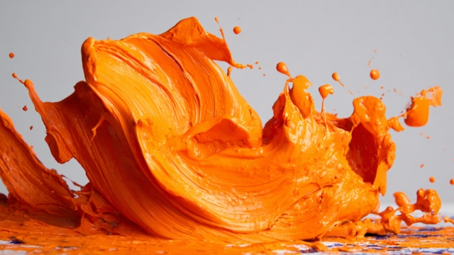
- Emotional Impact: Confidence, friendliness, enthusiasm
- Best Uses: CTAs, promotional banners, kid-focused products
Orange balances the energy of red with the approachability of yellow. It’s playful yet persuasive, perfect for encouraging clicks without feeling aggressive.
Statistics and Examples
- A marketing agency increased conversions by 32% after switching a landing page button from green to orange.
- Penguin Books and Blogger highlight their subscribe and purchase buttons in orange for visibility.
- Fast food chains and outlet malls use orange to trigger excitement and impulsive buying.
Orange thrives in clean designs where a single bright accent draws the eye to the desired action.
5. Yellow

- Emotional Impact: Happiness, energy, optimism
- Best Uses: Highlighting key info, food and beverage branding, youthful campaigns
Yellow radiates cheer and optimism. It’s fantastic for brands that want to communicate positivity or stand out in crowded markets.
But too much yellow can fatigue the eye, so it works best as an accent or highlight.
Statistics and Examples
- HEINZ sold over 10 million green (yellow-green) ketchup bottles in seven months, generating $23 million in sales largely because the unusual color grabbed attention.
- McDonald’s golden arches and National Geographic’s frame use yellow to spark energy and immediate recognition.
- DHL uses yellow to remain visible and upbeat, even from a distance.
Yellow buttons or banners can spotlight special offers or positive messages, but pairing with contrasting colors improves readability.
6. Purple
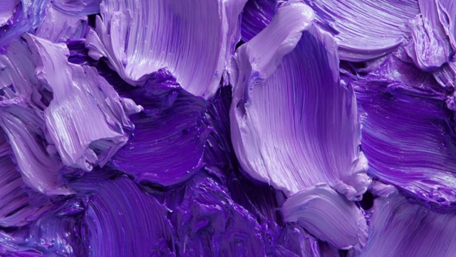
- Emotional Impact: Luxury, creativity, imagination, sophistication
- Best Uses: Branding for premium, creative, or tech-oriented products
Purple feels distinctive and refined. It signals exclusivity without the starkness of black. Creative industries, women-focused products, and high-end tech often use purple to stand apart.
Statistics and Examples
- Taco Bell’s purple branding supports its “think outside the bun” identity.
- Yahoo and Craigslist use purple to differentiate their digital spaces.
- Purple often scores high among female audiences and niche creative markets.
Purple is ideal for branding and background elements, but sparing use in CTAs helps maintain its elevated tone.
7. Black

- Emotional Impact: Luxury, elegance, authority, exclusivity
- Best Uses: Luxury brands, high-contrast websites, minimalist product pages
Black speaks of power and sophistication. While it’s less effective for driving impulsive actions, it excels at building a high-end brand presence.
Examples
- Rolls-Royce, Mercedes-Benz, and Lamborghini lean heavily on black to convey prestige.
- Black CTAs can work on lighter backgrounds but often serve better as part of a luxury-focused palette.
In web design, pairing black with white or metallic accents creates a sharp contrast that elevates visual appeal.
The Psychology of Color in Digital Marketing
Colors aren’t just decoration. They shape how people feel, how they process information, and even how likely they are to take action.
Color psychology looks at how different hues affect emotions and behaviors, which is why it’s an essential part of any high-performing marketing strategy.
- Red sparks urgency and excitement, which is why flash sale banners and “Buy Now” buttons often glow in red.
- Blue creates trust and calm, making it a favorite for banks, insurance companies, and tech brands.
- Green signals safety, health, and progress, often linked to eco-friendly and wellness products.
Marketers lean on these associations to influence behavior, whether the goal is to inspire confidence, drive impulse purchases, or guide the eye toward a key action.
Full-color visuals don’t just capture attention – they stick in memory. A study found that full-color ads are recognized 26% more than black-and-white versions. That extra recall can translate into clicks, sign-ups, or sales.
Why Colors Matter in Digital Marketing
Color impacts marketing performance in four primary ways:
- Attention: Bright colors like red and orange naturally grab the eye. This is why CTA buttons and promotional banners often rely on bold tones.
- Emotion: Each color sparks a feeling. Blue makes people feel safe, green promotes relaxation and growth, and yellow radiates happiness.
- Memory: Consistent use of color strengthens brand recognition. Think Coca-Cola’s red, Starbucks’ green, or McDonald’s yellow arches.
- Decision-Making: Color influences split-second judgments. Studies suggest that 90% of initial product assessments are based on color alone.
But there’s another layer: context and culture. A color that signals positivity in one culture may carry negative meaning in another. Purple suggests luxury in the U.S. and Europe, but can represent mourning in some Asian cultures.
Accessibility is also key. High contrast and color-aware design help users with color vision deficiencies navigate your site without frustration.
Best Practices for Using Color to Boost Conversions
Getting color right involves more than picking a bright shade. Marketers see the best results when they combine psychology, testing, and consistency.
- Maintain Consistency: Align website, ads, and emails under a cohesive color scheme. Consistency builds trust and improves brand recognition.
- A/B Test Your Choices: What works for one audience might not work for another. Test different button colors, banner highlights, and background accents to see what converts best.
- Respect Cultural Meanings: Check color associations for international campaigns. A color signaling positivity in one country may have a completely different meaning elsewhere.
- Prioritize Accessibility: Ensure sufficient contrast for users with visual impairments. WCAG recommends a contrast ratio of at least 4.5:1 for body text.
- Match Color to Context: Let your product and message guide your palette. Wellness brands often succeed with green, while luxury brands thrive with black or purple.
- Follow the 60-30-10 Rule: Use 60% dominant color, 30% secondary color, and 10% accent color to maintain balance and avoid visual overload.
Summary
@digital.gurkha Understanding Color Psychology 🌈🌈 #digitalmarketing #digitalgurkha #colors #psychology ♬ ElseParis – MiKeila
Colors carry weight in digital marketing. They influence first impressions, shape emotional responses, and guide users toward taking action.
Marketers who strategically apply red, blue, green, orange, yellow, purple, and black can capture attention, inspire confidence, and drive measurable lifts in conversions.
The key is thoughtful application. Test, track, and refine your choices. Maintain visual harmony across touchpoints. Respect your audience’s preferences and cultural context.
With a smart color strategy, every campaign element – from your website header to your CTA buttons – can quietly but powerfully move your business forward.