It’s hard to find a book on painting or photography that doesn’t open with a look into color theory.
Color wheels, complementary hues, pigment science — all the technical talk about how colors work. But what do these theories really reveal about the soul of an image?
You can almost picture artists like Millet or Rembrandt glancing at these charts, raising an eyebrow, and tossing them aside in favor of simply picking up their brushes and getting to work.
So, what if we explored complementary colors from a different angle — with a bit of irreverence, a dash of curiosity, and a genuine appreciation for both the theory and the instinct behind great art?
Rethinking Complementary Colors: Breaking the Rules (Just a Little)
What if we just threw out the whole idea of complementary color theory? Bold move, sure — but sometimes, it actually makes sense.
Just look at the image below: a woman in a dress that pops beautifully against a contrasting background. No rules are needed — it simply works.
In Expressive Painting, Joseph Stoddard kicks off his chapter on color by urging artists to forget the color wheel entirely. Instead of getting lost in theory, he suggests embracing experimentation over “an exhaustive analysis of color theory” (Expressive Painting — 2018, Quarto Publishing Group, p. 136).
And then, in classic art-book fashion, he goes on to explain the color wheel anyway.
Here’s my take on Stoddard’s color wheel, inspired by Expressive Painting. But let’s be honest — digital color representation is its own beast. Colors on a screen aren’t quite the same as those on paper or canvas.
Factors like screen resolution, brightness settings, color profiles (RGB vs. CMYK), and even your device’s calibration all mess with how colors appear.
In short, digital color is a useful tool — but no match for the real-world richness of paint and pigment.
Complementary Colors? Not Always Necessary

The idea that a picture has to work best when its colors sit opposite each other on the color wheel? Honestly, that strikes me as a bit absurd.
As with many theories, there’s a tendency for experts to take a look into complex explanations for things most of us naturally accept without a second thought.
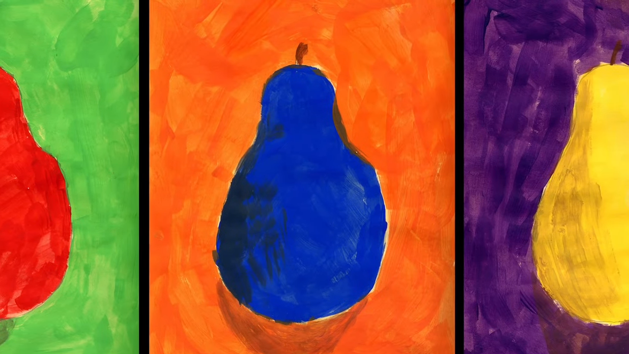
Don’t get me wrong — sometimes the complementary color principle works brilliantly, like in the image below. But it’s certainly not a universal rule.
This image leans heavily on the concept of complementary contrast. Technically, it’s more of a split complementary setup. But really — who’s keeping score?
I speak as both a painter and a photographer. For years, I worked in watercolor, gradually developing a personal style through exploration and instinct.
Now, I’ll admit — the scan of this piece doesn’t quite do it justice. The colors are flatter, less vibrant than the original painting. A common pitfall of digitizing art.
Still, at the heart of it, I see myself primarily as a colorist. I’ve never relied on a color wheel. Instead, I’ve cultivated my own palette — a personal library of tones and shades that speak to me.
But make no mistake: painting and photography are two very different beasts.
Photography — literally “writing with light” in Greek — is just as much about capturing color as it is about light. And in the photo below, we find split complementary colors again. Yellow and purple are classic complements, but it’s the punchy green in the shoes and towel that really elevates the whole scene.
Reimagining Reality Through Color
Colored composition (Hommage to Johann Sebastian Bachh) https://t.co/sONp6lXprO pic.twitter.com/x2TnkziNWt
— August Macke (@mackeaugust) July 4, 2024
One of the true freedoms of watercolor painting is the ability to reinvent the world — to color it however you wish, unbound by the rules of reality. Want to paint crimson trees or lavender oranges? Nothing’s stopping you.
And many artists have embraced this freedom.
Take the Expressionists, for example — August Macke among them — who made it a point to let emotion and intuition lead the brush. The color wheel? Most of them never gave it a second thought.
Cherry Blossom
Few color combinations feel more harmonious than pink cherry blossoms set against a crisp blue sky. They look like perfect complements.
But if you go strictly by the color wheel, they don’t qualify as complementary at all. Then again, does it really matter?
Of course, this entire conversation assumes a typical vision. Color perception isn’t universal — and yet, even artists with impaired sight have made some of the most iconic use of color in history.
Claude Monet, Water Lilies
View this post on Instagram
Monet’s most celebrated water lily paintings — including those displayed at the Orangerie in Paris — were created when his eyesight had significantly deteriorated. The blurred, dreamlike quality of these monumental works is often attributed to his limited vision at the time.
And yet, these paintings resonate deeply. Much like poetry, they capture a feeling — something sensed, if not entirely seen. Perhaps that’s the magic: the suggestion of form, the whisper of color, rather than the clinical precision of it.
Interestingly, Monet still instinctively made use of complementary colors — as in his cathedral series or the Water Lilies, where subtle pairings like purples and yellows show up with striking effect.
Long before Monet, painters were creating their own internal color systems. Dutch and Flemish masters — Bruegel, Bosch, and later, Rembrandt — crafted works rich with mood, often through limited palettes.
Rembrandt, in particular, leaned into warm, muted tones. Much of his work is bathed in a deep, earthy palette, with some of his most powerful pieces rendered almost entirely in shades of brown.
Proof, again, that impactful color doesn’t always come from contrast — sometimes, it’s found in nuance.
In Summary
So, what can we really take away from this exploration of complementary colors and color theory?
Whether we realize it or not, we all make use of it. Complementary colors naturally appeal to us — perhaps something hardwired in the human brain. I’m no neuroscientist, so I won’t pretend to explain why.
There’s a story that Georges Braque would carry his paintings into the wheat fields to see if they could hold their own against the rawness of nature. Maybe that’s the point — that art, whether painting or photography, should have its own presence. But does it really need to measure up to reality? Especially when it was born from it?
Personally, I’m not convinced we need more reality.
What we truly need are visions — escapes — moments of wonder that lift us from the weight of everyday life. Images that don’t just help us forget, but also help reimagine the world into something better.
And color plays a powerful part in that.
If complementary colors help bring that vision to life, then by all means, use them. But what really matters is something more personal:
That you, whether as a painter, a photographer, or simply someone who experiences visual beauty — maybe even just a curious browser on Jumpstory — discover and develop your own language in color. One that keeps imagination alive. One that keeps the dream going.